You can draw a straight line through any three points, if you use a thick enough marker. ~Old Russian joke
Defense Against the Dark Arts
It is my job to arm you against the foulest abuses of statistics known to mankind! You may find yourselves facing meaningless p-values, misleading charts and baseless inferences in this room. Know only that no harm can befall you whilst I am here. All I ask is that you remain calm.
Now – be warned! The world of dark statistics is nasty and treacherous. Even while learning to combat the corruption one often becomes himself tainted by the stupidity. So, before we dissect this affirmative action story from fivethirtyeight, some dire warnings:
Beware the statistician’s fallacy. life is messy and stats are hard. An experienced and motivated statistician will be able to find a nitpick in almost any article that uses statistics and dismiss the article’s conclusion while ignoring all the supporting evidence. I picked the above example not because the chart doesn’t present a conclusive case for its conclusion, but because it offers literally zero support for it.
Pick on someone your own size. It’s not hard to find people being stupid with statistics, I wouldn’t write about this story if it wasn’t from fivethirtyeight, an outlet I recently expressed my admiration for.
If you think affirmative action sucks – remember that reversed stupidity isn’t intelligence. A weak story misrepresenting the effects of affirmative action doesn’t “debunk” or discredit the entire endeavor. If you feel satisfaction because you’ve seen a critique of a weak argument for an opponent’s position while ignoring the strong ones, that’s the feeling of becoming stupider.
If you think affirmative action rocks – bad arguments hurt a good cause. First of all, it would be strange if someone values affirmative action for its own sake rather than valuing diversity and equality of opportunity. If you care about the latter, wouldn’t you be interested to learn how effective various policies are in promoting equality? In any case, supporting a bad argument is dishonest and makes your entire cause all the easier to dismiss. If a liberal friend of mine uses the Bible to justify allowing refugees, or a conservative friend claims that the refugee story is a corporate conspiracy to ensure cheap labor, I know they’re just in it for the signalling and their opinions can be safely ignored.
Remember, kids, epistemic virtue before statistics!
The goal of this post isn’t to say anything at all about affirmative action (AA) policies, but to show how a chart and a piece of data analysis can go terribly, horribly wrong.
Chart Forensics
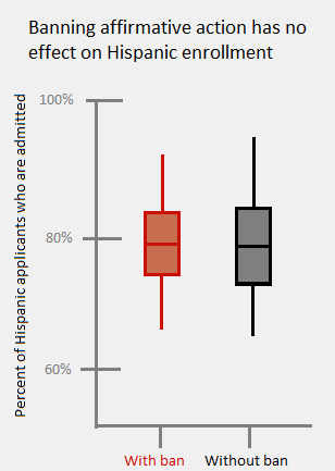
Here’s the offending chart from Hayley Munguia’s article:

At first glance, nothing insidious seems to be going on. Some grey dots, some red dots and some lines showing a relationship between them. We’ll need to break this chart into pieces to see how every chunk is individually wrong, and how they combine into a true abomination of data science.
Title

Clear, informative, straightforward. The only problem with the title is that it was written before the author actually looked at the data, and the data unfortunately refused to cooperate.
X-Axis

Hold on, AA kicks in only when someone applies to college, why are we looking at share of state population instead of college applicants? Hispanics drop out of high school at a much higher rate (15% vs. 10% for blacks and 5% for whites). I’m pretty sure high school drop outs don’t apply to college. On the flip side, perhaps more Hispanics who are hard-working but marginal scholars make the smart choice of pursuing a vocational career instead of wasting four years for a useless degree with negative ROI and a mountain of debt.
Y-Axis

This measure makes slightly more sense, but the number we’re interested is the acceptance rate of Hispanics, whether relative to number of applicants or population. That in itself should be one of the axes, probably the only one. Wouldn’t the chart be much clearer if it looked like this:
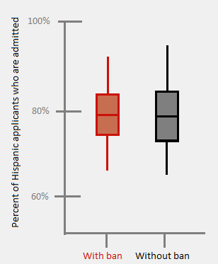
In fact, I’m afraid a simple box plot would make the story so clear that there wouldn’t be an article at all.
Once the axes don’t make sense and don’t measure what you’d want to measure, nothing is there to stop a torrent of baffling obfuscation.
Trend Lines
A trend line is useful when we are looking to extrapolate a point outside it a data set from the information inside it . For example, predicting an unknown future value from a past time series. Nothing like that happens here: the entire USA is inside the data set and not outside it.
The article has a chart for black students in which the “ban” trend has a higher slope, does this mean that banning AA is good for blacks? Should we extrapolate that a hypothetical state with a ban on AA and 75% black population will have 90% black college students? We’ll get back to the trend line later.
Data Points

It could be argued that the trend of enrollment vs. population size shows how larger populations of Hispanics are affected. If so, why not account for population directly with a single point for each state or each million people? Instead, each data point shows the enrollment in separate colleges, and each college is given the same weight regardless of size.

Texas is the third column from the right, it’s shown in gray as a state that (currently) has AA. It also has a lot of gray dots very high on the chart (making AA look good) which immediately got me suspicious. Texas’ two largest universities, Texa A&M and UT Austin sit at 15% and 21% Hispanic enrollment respectively, well below the “trend” line. The two universities at the top, UTRGV and UTEP have a combined enrollment about equal to UT Austin, but count as two different data points.
That doesn’t mean they affect the results twice as much, it’s much worse than that: by all appearances, the “trend” lines are a product of simple linear regression, which is calculated using the method of “least squares“. Without getting too technical, each point “pulls” the regression line towards it with a strength proportional to the square of it’s distance from line (was that too technical?). A point that is twice as far from the line pulls 4 times as hard. Points that are really far away from the line are outliers, and have a huge influence on the slope of the line. In cases with outliers it is wiser to exclude those points or avoid using least squares altogether.
Without UT Austin (21%) and UTEP (73%) the regression line at Texas is around 28%, which is much closer to UT Austin. This means that UTEP as a whole has 41 times as much influence as UT Austin, each student at UTEP has 95.8 times as much influence!

Besides accounting for size, the data can also be aggregated at different levels: by state, by college, all ban/non ban states together etc. Using the wrong aggregation level can mistakenly lead to the opposite interpretation of the actual data, in what is known as Simpson’s paradox. Ironically enough, the most famous example of the paradox in action was in a controversy about college admissions.
In 1973 UC Berkeley (which we’ll get back to) was sued for gender discrimination because it admitted 44% of male applicants but only 35% of female ones. However, when looking at individual departments, the majority were likelier to admit a woman. The secret? More women applied to extremely competitive departments like English (7% admission) while men applied more to less selective departments like chemistry (65%). Since the departments make their own admission decisions, grouping by department gave the correct conclusion that there was no bias against women.
Banning AA is a state-wide decision, so what happens when you group by college instead?
UTEP is situated in El Paso, a city that is literally right on the Mexican border, has 81% Hispanic population yet enrolls only 73% Hispanic students. So UTEP under-admits Hispanics, and so does almost every college in Texas, but since a few colleges just happen to have a ton of Hispanic applicants, on the chart it makes Texas look like it has a great record of admitting Hispanics! Framing UTEP as an argument for affirmative action helping Hispanics in Texas isn’t absentmindedly negligent, it’s criminally creative.
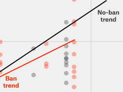
The Unintelligible Cloud of Dots Close to the Origin

Of course, on the other side of UTEP we have a bunch of colleges in states with low Hispanic population, the ones that would be most interested in increasing Hispanic enrollment in the name of diversity. The baffling choice of axes makes all those colleges invisible and reduces their effect on the regression line to practically zero. It’s hard to see this horrible mess, but I can tell two things about states with low Hispanic population:
- States that have banned affirmative action have a much higher relative enrollment of Hispanics than those with AA. We can see it in the red “trend” line being higher on the left side of the chart, where all the points are.
- This point directly contradicts the story that the article is trying to sell you, so the data was squeezed into an indecipherable jumble.
To clarify, here’s a zoomed in version of the jumbled region:

Going back to Berkeley, this NY Times story on the “holistic” admission process in California can shed some light on why states that ban AA could have more Hispanics admitted. Without AA, the favoring of underrepresented races is just as strong, it’s just not explicit. Berkeley is 43% Asian in a state that’s only 15% such, and here’s what the NY Times writer observed:
After the next training session, when I asked about an Asian student who I thought was a 2 but had only received a 3 [lower is better], the officer noted: “Oh, you’ll get a lot of them.”
The Real Picture
– psst
-What?
–Did you know that Hispanics have a higher college enrollment rate than whites?
-Oh, you mean if we compare equally qualified applicants?
–No, we’re not controlling for qualification.
-You’re probably adjusting for socioeconomic status or something.
–Nope, it’s the entire national population of high school graduates aged 18-24, everyone who could possibly want to apply to college.
-No way.
–Yes fucking way, from the Pew Research Center:

No matter how you twist the data, three things seem to be pretty obvious:
- Dropping out of high school negatively affects your chances of enrolling in college.
- If you didn’t drop out, being Hispanic (as opposed to white) doesn’t negatively affect your chances of enrolling in college.
- Banning affirmative action doesn’t affect Hispanic enrollment in college, except maybe giving it a little boost in states with low Hispanic populations.
So how did Ms. Munguia deduce the conclusion that banning AA hurts Hispanics from the data? She never did, the conclusion came first and the chart made it too confusing for most people to tell either way. Deciding on a conclusion ahead of time and then sticking with that conclusion despite your own fricking data contradicting it is something you’d expect from, I don’t know, The British Journal of General Practice or something, not from 538. BTW, that’s a pretty good link if you like hate-reading about statistics abuses as much as I (clearly) do.
Train Your Nose
The goal of this post isn’t to attack affirmative action but to train you to spot dirty bullshit in a pretty chart. The wisdom of the elders says that it is easy to lie with statistics, but it is easier to lie without them. Bad charts and bad statistics leave telltale traces of chicanery: fishy measurement units, dubious aggregation levels, irrelevant regression lines and much more. A trained nose can spot these a mile away.
Detecting all the giveaways is hard, so here are two quick tips that will do you the most good:
- Don’t look at the title! Look at the actual chart first and see what result jumps out of it. If the title is about something else, it may be that the bottom line was written before the data.
- Ask yourself: what should the simplest chart look like that answers the question posed? If the chart in front of you looks nothing like the one you imagined, someone’s hiding something. That something is probably the truth.
I emailed Ms. Munguia a few days ago with a more polite summary of the questions I had about her chart and the data. I’ll update this post immediately if she writes me back, even (especially!) if her response makes me look like an idiot.
Next post is finally up.
P.S.
There’s now a full, clear archive of all the posts so far, which I also hope to turn into a suggestion thread.

So we’re going to make and hold New Years promises?
I can only hope you have a positive change in mind.
LikeLike
I know you wanted to brush affirmative action aside, but I don’t really get how it hurt the blacks. I don’t know exactly what goes under this label in the US but I assumed it was some kind of quota system. Should’nt this scenario be only possible if they were outperforming the national average (and then why would there be a call for affirmative action?) in the college entry rates?
LikeLike
@Your Greatest Fan #2
Racial quota systems have been banned in the United States. Instead, university administrators are allowed to perform “holistic review”, incorporating a variety of factors, such as race, socioeconomics, hobbies, awards, etc. Race can only be considered for the goal of “promoting diversity” in the student body. If exclusive examination of objective factors would lead to only 100 Hispanic applicants being admitted, and that isn’t “enough” for a “diverse” student body by the administrators’ standards, they are free to admit a few more Hispanic applicants. Just as long as there’s no evidence they are seeking a specific number.
LikeLike
So it sounds like a university could be going for something like 10% Hispanic. Now since quotas are bad, no one in the admissions department is allowed to say “10%” out loud, and if AA is banned no one is allowed to say “Hispanic” out loud, but they still try to get to 10% Hispanic.
Is that too cynical or is it not far from the truth?
LikeLike
https://twitter.com/OscarNLane/status/679596404612857856
LikeLike
I stopped visiting 538 a while ago and have never returned. It’s glib, biased and agenda-driven. Thank you for this astute analysis confirming what I’ve found at that crappy website.
LikeLike
“Hispanics have a higher college enrollment rate than whites”
and
“Hispanic high school completers have a higher college enrollment rate than white high school completers”
are two very different claims, because – as you say in this very article – the completion rates are different; looking at your own data it looks as though the former is false, or at any rate was at the time this was written.
I’m afraid I think that conflating the two constitutes precisely the kind of misrepresentation that you are trying to make a big point of not engaging in.
LikeLike