Income inequality is exploding in the US. Or at least, talk of income inequality is. Newspapers are full of it. Presidential candidates build their platforms around it. A 700-page book about economic inequality sells at quantities usually reserved for vampire romance. The Pope tweets about it (about inequality that is, not about vampire romance, although he cares about that as well).
Has inequality really gotten so… unequal? If it has, what are the actual negative consequences? If the consequences are terrible, what can we do about them? If we can’t do anything, should we find someone to blame and yell at them? In the next two posts I’ll get these issues of inequality, but first we need to address the issue of quality: 99% of what you read about inequality is crap.
As discussions of economic inequality became mainstream, economists have warned that inequality is incredibly hard to measure, let alone predict. In response, everyone agreed to tone their rhetoric down until we can all agree on a reasonable approach.
Just kidding! Everyone kept shouting whichever version supports their favorite political position. Both sides of the political aisle are happy to present terrible numbers and ignore any and all inconvenient facts, but the higher volume (in bulk and in decibels) of inequality discussion is coming from the economic left. If you want to get clicks, a good bet is to write how inequality is super-terrible-worse-than-sparkling-vampires think piece with a chart or two sprinkled in. I’m going to mainly list the flaws in these types of articles, since I want to focus on inequality itself for now and not on the general left-right economic debate. Many of the “rising tide lifts all boats” arguments coming from the right are equally vacuous, but won’t be addressed here.
Here are several ways in which a writer can make inequality appear as horrifying (or benign) as they think their readers will like to hear:
compare wealth instead of income
What does it mean to be poor? Does it mean low wages, low income after taxes and transfers are accounted for, or simply low expenditures?. You may intuitively think that being poor means having low wealth, but that doesn’t work if you measure wealth in a straightforward manner. Unlike income, many people’s wealth is negative even if their lives are affluent and secure. Think of a young lawyer at a prestigious firm with student loans from a top law school. Her wealth (loans included) could be -$150,000 which puts her well in the bottom percentile by household wealth. However, the young lawyer making six figures isn’t really suffering from economic hardship.
Adding in negative wealth numbers allows you to come up with arbitrarily stupid statistics like that the top 20% own 511 times as much wealth as the bottom 40%. At around the 37th percentile, the cumulative sum of wealth is a tiny number close to zero. My own humble personal wealth is a trillion times higher than the bottom 37% of US households, and a negative trillion times higher than the bottom 36.99%.
I’m not a violent person and don’t have many unshakeable principles, but I will punch anyone quoting statistics that compare aggregates of positive and negative numbers.
While aggregating wealth is stupid, it seems to weird not to count it when comparing the rich and the poor. I think there’s a very intuitive way to combine wealth, income and economic power into a single useful measure. It’s what the finance world uses to value everything from loans to companies: the net present value of future earnings.
If the bottom 40% really owned nothing, the 1% could, for example, buy all the houses in the US and the 40% would end up homeless. The reason people are willing to sell a house to somebody who has no wealth is that they can count on the homeowner’s income paying for the mortgage. Every American citizen has inherent wealth in their potential to earn income, or at the very least in their potential to collect a welfare check. Of course, earning potential isn’t distributed equally and depends on things like education, social class, and actual wealth already owned. That potential wealth can be calculated, discounted at a proper rate and added to current wealth to paint a much more sensible picture of inequality. I’ve never seen anyone do this.
Either I’m a creative genius (quite possible) or economists have shied away from assessing the NPV of people because it’s impossible to do with any accuracy. Of course, this isn’t something that intimidates this specific blogger. We’ll put a number on Americans’ NPV in the next post of this series, but first there is more bullshit to guard against.
pick convenient end points
If you measure income growth from a peak year that came just before a recession (like 1979 or 2007) to a year just after the a recession ends, the numbers look terrible for workers because the (forward looking) stock market rebounds much faster than wages. On the other hand, if you measure from 1982 to 2007 the growth looks amazing. The business cycles in the last few decades have been so volatile that you can see any trend you want in the data with a judicious choice of end points.
“forget” to adjust for household size
Almost all inequality statistics use a household as the basic measuring unit, but conveniently ignore the fact that households contain varying numbers of people.
Let’s imagine a completely made up example of a guy living for a year with his ex-girlfriend because neither of us them could afford a one bedroom in NYC by ourselves themselves. Then I the guy got a raise and my ex the girl switched to a job that doubled her salary and moved into a studio apartment and dated a weird Ukrainian dude lived her life as she saw fit. Both of us are now making more money (and have more sensible living arrangements), and yet the statistics would show that the average household income decreased because there are two households instead of one.
People at every age group and education level are less likely to be married and have less kids than 40 years ago. High school educated people in their thirties have exactly one less child per household than in 1970, that leads to a lot more disposable income per person that isn’t going to show up in household income data. There’s an argument that households are smaller because people are poorer, but that doesn’t bear out in the data in any way. My ex isn’t living by herself because she’s too poor to marry, she’s living by herself because she’s rich enough to afford it and is an independent woman whose choices I respect.
Still, 4 people living together can live much cheaper than 4 individuals. There are various household size adjustments, the simplest is to divide income by the square root of the number of people. So, a married couple with two kids is assumed to have twice the expenses of my ex a single person.
forget to adjust for a million other things
Let’s start with the most obvious adjustment: inflation. If you double your income but everything you buy is twice as expensive, you’re no better off. So what’s the problem? Well, by some measures inflation has been much higher for rich Americans than for poor ones. That’s because poor Americans buy Chinese goods and shop at WalMart which between them keep prices really low. That’s also why every politician blames foreign trade and large corporations for inequality. Go figure.

Rich people spend much more on services (accountants, vegan chef nannies) and luxury goods, which are both “produced” in high-wage countries and aren’t for sale at WalMart. They also spend a lot on positional goods, and so see much higher inflation. You could also argue that inflation of Ferraris is a result of rich people becoming richer and not a hardship. It’s a choose-your-own-deflator adventure, and the choice is mostly driven by the agenda of the person showing you the data.
Another factor is work hours: households in the top 20% by wage work twice as many hours (3,969 per year) as the bottom two quintiles (1,719 and 2,663). Are the rich people simply hard working folk that deserve the fruits of their labor? Maybe they’re just lucky to have cushy jobs? Or perhaps the top are all married working couples and the bottom is single moms with five kids who can’t even afford to work? Pick your narrative and adjust away!
ignore immigration
The US houses 35 million immigrants from the developing world, with another half million joining them every year. That’s more poor people coming every 3-4 years than the entire deluge of Syrian refugees accosting Europe. If all the American poor are getting richer and the poorest percentiles are replaced each year by broke immigrants (who are still much richer than they were in their home countries), this wholly positive trend wouldn’t be reflected in the overall income distribution statistics.
compare the USA only to European welfare states
And ignore the billion people lifted out of extreme poverty worldwide in just the last two decades. Globalization tends to decrease inequality worldwide, but increase it within each country. If Apple weren’t allowed to sell their iPhones abroad, its American engineers would be earning less and so would the Chinese workers who assemble the phones.
With all that said, here’s how the US actually stacks up to Europe (USA is the top line in navy blue):
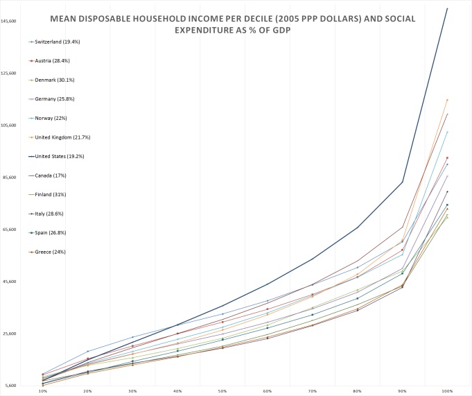
Despite wildly varying social expenditures, income-wise the US looks remarkably like a Finland or a Norway except with a bunch of millionaires added on top of everyone else (it’s true that this chart doesn’t account for quality of public services). Is having a bunch of millionaires in your country a good or a bad thing? Whatever it is, it’s the single issue everyone in the US seems obsessed with.
fixate on the top
A curious feature of many inequality crusaders is their often single-minded focus on the Top One Percent, henceforth abbreviated TOP. (Rhymes with GOP. Snap!) Are most Americans’ lives affected by whether Warren Buffet owns two yachts or twenty? Or even by Google deciding to give it’s top developers a raise? There may not be a big house, a spot at a decent college and a rewarding job for every single American, but there are enough for more than 1% of the people. There are very few things that normal people compete for against the TOP.
One area where people maybe do compete with the TOP is buying congressmembers, but it’s actually pretty hard to buy political outcomes even with lots money. I think it would be much scarier if the TOP’s money was evenly split among 50% of the population. In that case, the same amount of money will come with a vastly larger voting constituency, to the point where the rich 50% could utterly dominate everything in the country to the detriment of the bottom half. Does the concentration of money in few hands helps these hands to coordinate effective class warfare? It seems far fetched. I wouldn’t know either way, I’m just one of the stupid sheeple manipulated by the elite.
What if the rich isolate themselves or fly away to a pristine space station like Elysium? Well, if the rest of us can’t manage to run a normal economy with the rich people gone then I guess we deserve to live in squalor.
There are perhaps good reason to worry specifically about the very rich getting richer, but the attention paid to the TOP seems out of whack with the severity of the problem. I was about to give a list of articles in popular outlets discussing inequality mainly through the lens of TOP, but then realized I didn’t see any that hadn’t. Did you know that the top 1% account for 57% of the words written about economic inequality? So unfair!
When someone says they’re talking about the middle class getting poorer, they often still talk about the rich getting richer. Here’s The Atlantic in a section titled “Goodbye Middle Class”:
A recent report by the Center for American Progress shows that in 1979, a majority of American households (59.5 percent) had earnings that qualified them as middle class (defined as working-age households with incomes between 0.5 and 1.5 times the median national income). In 2012, the share of middle class families had fallen to 45.1 percent, indicating that American households have become more concentrated at the top and bottom of the earnings ladder.
Why is that a problem? For one thing, mobility: More of the middle class is migrating to the lower class due to stagnant incomes and the increasing cost of living—which means more Americans are struggling to make ends meet. That’s not just bad for families; it’s bad for the economy.
And they present this chart:

I couldn’t replicate these numbers exactly, but the US census data shows the same trend. Using the “0.5-1.5 of median wage” definition, the middle class has indeed decreased from 53% in 1967 to 51% in 1979 to 45% in 2012.
In ’67, the 24-87th percentiles earned middle class incomes. In ’79 it was 24-85. In 2012 it was 24-79. The percent of households earning below half of the median wage has not changed one iota in half a century. The median wage itself could be dropping, which would be an actual problem, but the entire “decline” in the middle class is entirely caused by middle class people achieving escape velocity and becoming rich. Imagine the horror!
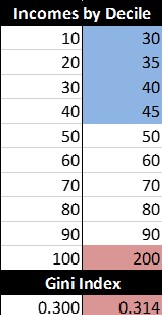
Even objective-seeming indexes of inequality mostly measure how rich the very rich are, since there’s not a lot of room on a national scale for the poor to be super poor. The most widely used measure of inequality is the GINI coefficient, which uses a simple formula to look at a distribution of income or wealth (a lower coefficient is more equal). Below I’ve simulated two economies, in the first one the income grows linearly: the bottom 10% make $10, the second decile makes $20 etc. In the second case, I doubled the income of the top decile but also increased the wages of the entire bottom 40% and compressed the entire distribution. Basically, the second economy has no poor people: only a huge middle class and few rich people who got richer. And yet, GINI got worse.
With all that said, there is one really good reason to focus on the TOP in the US: they have a lot of money, and everyone else could use that money. Whether concentration of wealth impacts everyone negatively or not, and whether the TOP came by their riches by fair means or sinister, there’s a big opportunity and a temptation to redistribute that money around. Robin Hooding hits on two important topics: ethics and incentives. I’ll discuss both in part 3 of this series.
A shining example
Let me end that long list of cautionary tales with a heartwarming story of a country that embraced innovative policies to overcome terrible inequality. This large and diverse nation emerged from a century of frequent warfare facing serious economic issues. Most of its population lived in poverty while the TOP earned over 22% of the entire gross income. In their hour of inequality, the nation’s voters elected an anti-war party that also promised a complete social and economic overhaul.
Unlike most politicians, that party actually delivered. In the four decades that it was in charge, the income share of the TOP plummeted by more then half (to 9.9%) and so did the poverty rates. The income per capita, now much more equally distributed according to GINI, skyrocketed by a factor of 10. The country transformed from a poor backwater to a dynamic emerging market.
Where did that economic miracle occur? South Africa, 1948-1994. Either the secret to a thriving, equitable economy is complete racial segregation, or there’s something messed up with the way most people measure equality.
![]()
Who wants some orange-tinted populist nationalism?
In part 2 in this series I’ll start by asking “what’s the actual harm of inequality?” in a utilitarian framework and focus on the data and measurements that are most relevant to that question. There will be a ton of charts.
In part 3, I’ll assess the utilitarian case for and against various ways to solve the bad things about inequality. I’ll also present some creative ideas that aren’t being discussed a lot because of the goofy way inequality is usually debated.

Typo:
I’m just one the stupid sheeple manipulated by the elite. .. one of
LikeLike
I think that a sentence about my own ignorance should be allowed to have a mistake in it ;-)
LikeLiked by 1 person
A couple of points:
1) Another reason a bank (or something else) lends you money as a mortgage is that if you don’t pay the mortgage, the bank will foreclose on the home and be able to apply the money from the foreclosure sale to the outstanding debt. In short, you have a collateral obligation pitted against your debt. It’s, in a way, more selling something you own (in the legal sense of the term) and then slowly buying it back. In these cases the correct way to reflect someones home ownership in measuring that persons wealth is to take the amount of equity the person has in the home. This same principle can apply to some other measures of wealth. This is very different then how an education loan works.
2) In your Gini co-efficient example, there are different total numbers for the two societies. This could represent that the second economy has more income all together or that it denominates money in larger numerical units. Or both. Or something else. I don’t know. I’ve taken the liberty of normalizing tables for 100 units of money for both economies. You’re welcome.
Bracket, Relative income normalized society 1, same for society 2;
10, 1.82, 4.29;
20, 3.64, 5.00;
30, 5.45, 5.71;
40, 7.27, 6.43;
50, 9.09, 7.14;
60, 10.91, 8.57;
70, 12.73, 10.00;
80, 14.55, 11.43;
90, 16.36, 12.86;
100, 18.18, 28.57;
It seams that relative to the total amount of income in their societies, the poor of society 2 have higher incomes then the poor in society 1, the middle of society 2 have lower incomes then the poor in society 2, and the rich of society 2 have higher incomes then the rich of society 1. The rich having higher incomes serves to raise the Gini co-efficient and the poor of society 1 having higher incomes serves to lower it. It seams that the effect from the rich outweighs the effect from the poor. Maybe the Gini co-efficient is working as it’s supposed to.
3) More on the Gini co-efficient: I am a fan of looking hard for the best measure to answer the specific question one has. If one wants to know about overall income inequality (say to determine where your company should direct marketing) then the Gini co-efficient might be the best measure of inequality relevant to the task. If one wants to measure the ability of the poor to afford things then one should use a different measure. Perhaps measuring how many people are in poverty by the measure of what percentage of population earn bellow (I can’t remember of quickly find the definition I once learned) something like 1/2 the median income or 1/4 the median income would better answer this question.
LikeLike
I wrote the comment. Read through it twice. Made some changes. Posted it and almost immediately realized I made an error. I apologize for the double comment.
The correct wealth measurement for a home owner would be the current value of the home (that is the amount it would sell for) minus the amount left outstanding on the mortgage (if it would all be payed back today).
This is not the same thing as the equity. It is greater if the home has grown in value and less if the home has shrunk in value (assuming a fixed mortgage). For most situations and assuming the buyer payed a positive down payment, owning a home is net positive wealth.
LikeLike
> Either I’m a creative genius (quite possible) or economists have shied away from assessing the NPV of people because it’s impossible to do with any accuracy.
As you point out, finance folks frequently assess the NPV of companies’ future earnings. While I don’t know the literature well enough to point to any particular papers, I’m guessing lots of economist-hours have gone into studying these assessments and debating their accuracy. In particular, you may have to dive into discussion of Thaler’s “The Price is Right” interpretation of the Efficient Market Hypothesis to find the relevant literature.
LikeLike
Calculating NPV explicitly is the opposite approach to trusting that the markets always discover the correct price on their own. I’m going to do the former, because there isn’t really a public market valuing private people and no way for me to buy an equity share in a single person (although that would be cool, and I want to write a post about it). I’m sure that financial institutions do something akin to personal-NPV when deciding to give someone a loan, but I haven’t seen this published for the broad population by someone like the US Census Bureau. I guess it will have to be me :)
LikeLike
> I think it would be much scarier if the TOP’s money was evenly split among 50% of the population.
I can’t resist injecting one of my favorite quotes. This is from Plutarch’s Life of Cicero:
> And Rome was most dangerously disposed towards change on account of the irregularity in the distribution of property, since men of the highest reputation and spirit had beggared themselves on shows, feasts, pursuit of office, and buildings, and riches had streamed into the coffers of low-born and mean men, so that matters needed only a slight impulse to disturb them, and it was in the power of any bold man to overthrow the commonwealth, which of itself was in a diseased condition.
Worth noting that Plutarch is narrating Cicero’s struggle against Cataline, hence the “bold man” comment.
LikeLike
That quote is really confusing: if the patricians are men of such high spirit, how do they go bankrupt on shows and feasts? And if they don’t thirst for power (like the “mean men” do), why do they spend so much on pursuit of office?
I think that the main difference between the top 1% and top 50% using money in politics is in their goals. Larry Page and Elon Musk may care about how the government regulates self driving cars, but they may not be too concerned with their marginal tax rate. On the other hand, the 50% would very much concentrate on redistributing money to themselves because their financial situation isn’t that secure.
For example, they may ask the government to subsidize college but not elementary school, or to give tax breaks for mortgage payments but not for rent. Both these things would be a straight transfer of money from the lower class to the middle class and both these things… are already happening in the US. Damn you, greedy 50-percenters!
LikeLike
Enjoyed reading it. Looking forward to continuation. Less concentrated readers may benefit from brief summaries and/or abstracts.
LikeLike
Oh, I don’t know… Usually I can’t manage to read a whole article, but these are so well written and informative that I always end up wishing for more by the end!
LikeLike
“Either I’m a creative genius (quite possible) or economists have shied away from assessing the NPV of people because it’s impossible to do with any accuracy.”
You can probably go back 40 years, take a cohort of 25 year olds and measure what their subsequent lifetime income was. There are some references to this type of analysis in the IFS Mirrlees review of taxation (which has good data, misses some bits of theory, and often lets the IFS desired outcomes dictate policy which contradicts the theory they present – still one of the better summaries out there).
LikeLike
Could you put in links to part 2 and part 3? or list their titles? I’m having trouble finding them.
LikeLiked by 1 person