I came up with this idea originally as an intro to the next dating post, but I think it’s neat enough to deserve it’s own post. Besides, this post talk about with Trump and the next post about radical feminism. I got worried that having both in the same essay will cause the entire blog to spontaneously self-combust.
Once upon a time, my Facebook feed was a pleasant enough collection of baby pics, joke links, humblebraggy travel photos and emojied birthday wishes. It was all so innocent and serene. Now my Facebook feed has turned into Trump-Trump-Bernie-Trump-birthday-Trump-Trump. A Trumpost starts with a story or a video comparing Trump, unfavorably, to either Hitler, Mussolini, or Asmodeus, Lord of Torment and King of the Nine Hells. Next comes some general wailing and gnashing of teeth about the future of democracy in America. Finally an angry repudiation of Trump’s electorate. That electorate is regarded as some alien race, a group that is fundamentally apart from all right-thinking Americans in either their extreme gullibility or their sinister malevolence.

Per my philosophy of democratic passivism I don’t engage in the object level debates about political candidates, but the latter point got me thinking. It seems that my (mostly cosmopolitan and liberal) friends in NYC picture the support for Trump’s immigration and foreign policies is distributed like this:
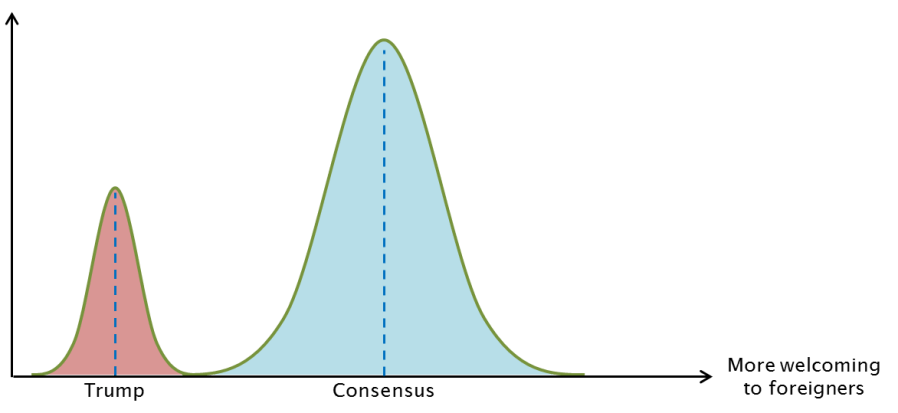
They see a large group of people (themselves) around the consensus position on foreigners with a minority of Trumpers forming a clearly distinct group.
Without knowing anything about the actual attitudes of Americans on these issues, I can reject the above picture based on a purely mathematical reason: the central limit theorem. The CLT states that under reasonable assumptions, if you take a bunch of random variables their average or sum will be distributed like a normal bell curve. And if you look at the distribution of any trait that’s made up of many components (as long as they aren’t perfectly correlated), you’ll get something that looks like a bell curve as well – at the very least the distribution will be roughly symmetrical and with a single peak in the middle. That’s because we can see the trait as the sum or the average of each component’s influence
The canonical example of a normal distribution is human height, which is a single variable made up of a lot of components: 400 different genes, at least dozens of nutrients and environmental effects. It’s very improbable that someone will have the “tall” or “short” version of every single component, these are the very rare outliers. If you got 250 “tall” alleles out of 400 and good nutrition you’ll be a bit taller than average, if you got 100 maybe you’ll be shorter, most people would be around the average.

The same should work for your attitude about foreigners. It’s influenced by dozens of factors: your education, your job, your social circle, whether you’ve traveled the world, whether you happen to like a country’s cuisine etc. The most likely model is that xenophobia, like most other things, is distributed on a bell curve with few outliers and most people in the middle. So what does that model have to say about Trump being so popular? Does it mean that most Americans secretly hate Mexicans, Chinese and Muslims with a passion equal to Trump’s? Not necessarily.
Speaking of the Chinese again, you may remember that the number of outliers on a bell curve is driven mostly by shifts in the average. If Trump is 3 standard deviations more xenophobic than the average American, only 1 out of 740 Americans are as extreme as he is, that’s a tiny fraction. However, if the average American moves just 1 standard deviation in Trump’s direction, now he’s only 2 SD out with 1 in 44 Americans at his level (2.3%).
Trump wouldn’t just get votes from people who are as radical as he is. He should get support from anyone who is closer to his position than the current American political consensus on immigration. If the average American voter (dashed black line) is 1 SD more xenophobic than the consensus (dashed blue line) and Trump is 2 SD on the other side. That means that everyone who’s a mere 0.5 standard deviations to the left of the median voter will be closer to Trump than to the prevailing politics. In a normal distribution, you’ll find 31% of the people to the left of the -0.5 SD line, that’s the red area of Trump supporters on the chart. Coincidentally, that’s about Trump’s current share of the voters. That’s the magic of shifting curves and averages: you only need 2% of people holding your exact position to get 31% of the vote!
It’s important to notice that the vast majority of Trump’s supporters are less xenophobic than he is: most of the red area is close to the “Trump swing line” (the black dotted line on the chart) than to the extreme left. They just lean slightly more towards Trump than towards current policies, or the policies of his opponents.
Most importantly, bell curves let you discover where median is from comparing the relative size of outliers. The mirror image of Trump on the other side of the political consensus is the Open Borders movement. They present a clear case based on moral imperatives and economic research that shows that free immigration could make the entire world twice as rich. They are also a fringe group with a tiny number of adherents, compared to the millions of Trumpers. When the average moves a little bit one way, the number of outliers in that direction grows and the number in the other extreme collapses.
The disparity between Trump and Open Borders tells me that the average American is slightly closer to Trump, slightly more uncomfortable with immigration, more suspicious of foreign competitors and more hawkish on terrorism. Maybe she’s not in favor of banning all Muslims entering the US, but she wouldn’t mind if the Air Force sent a couple of drones Agrabah’s way.

Paradoxically, even though most Americans are closer to Trump than to Open Borders, Trump faces all of the vitriol because the number of his adherents swells. No one wastes their time arguing against an unpopular niche position.
Looking at another political dimension, we can learn about the average Americans’ positions on the left-right economics scale from the relative number of adherents to socialism and libertarianism:

Bernie’s popularity relative to Rand Paul doesn’t mean that everyone’s a socialist, just the the average American shifted to the (economical and chart-wise) left relative to the current political status quo: slightly in favor of higher taxes, more redistribution and stricter market regulation than the prevailing policies. A hint of that came a few years prior, when the occupy movement occupied it’s moment in the sun. It didn’t sweep up the entire nation, but there’s a noticeable lack of popular organizations pushing in the opposite direction.
The best evidence for the “single curve shifting” model is when you see the three things happening together: the average moves one way, outliers that way grow and outliers the other way diminish. That’s the way it happens with religion and secularization: the number of the religiously unaffiliated and atheists (outliers in the direction of the trend) grows, the number of people who are very religious falls (outliers in the opposite direction) and the average American becomes less religious. As an example indicator, the median American switched from opposing to supporting gay marriage in a few years.
I am not passing value judgments on either of these trends, although as a foreign-born rationalist with an MBA you can guess where tribal allegiances pull me on questions of immigration, religion and socialism. Here I am merely anthropologist, looking for a useful model to understand what goes one in the hearts and minds of the people around me.

I don’t mean to imply that every single social process can be reduced a bell curve shifting, and this model is often too simplistic to make accurate quantitative predictions. The strong point of this model is parsimony: it makes very few assumptions (that the phenomenon consists of many components that aren’t too strongly correlated and neither of which is dominant) and it estimates a single parameter: the population average. If you have complex data that contradicts this simple model you shouldn’t hesitate to reject it, but until you do a shifting curve is a good place to start.
The power of this model is in letting you estimate where the median of a distribution is from the relative population of outliers and vice versa. If you tell me that the average weight of Americans increased (middle) I’ll predict that obesity rate has also gone up (outlier). If you tell me that obesity rates have gone I’ll assume it’s because the entire population has gotten fatter and not just a few overweight people who have crossed the line.
With the bell curve in mind, I am looking to solve the eternal question men have struggled with since time immemorial: What do women want? What are women worried about or excited about when dating? How does the median woman in my broader social circle feel about gender relationships in general? You can ask ten women and get eleven answers, and you wouldn’t know where each one lies on the distribution. So, we’re going to apply the Trump trick: look at outliers to estimate where the median opinion differs from the perceived consensus. In other words, in the next post we’ll see what we can learn from this:


I am sitting on the edges!
LikeLike
Is there a typo in “Most importantly, bell curves allow you to tell a lot knowing about about the average from comparing the relative size of outliers.”?
LikeLike
There was, fixed it. Thanks!
LikeLike
I’m not sure how to interpret the “cultural consensus” line on the plots. E.g. in the first bell curve picture, it’s a blue line further away from Trump than the median voter, so I assumed it represents your facebook feed’s consensus, cosmopolitan and liberal? Then in the last picture it’s further away from feminism than the average woman’s position, which is the opposite of where it’d be if it was the consensus of the same group of people.
LikeLike
I think “consensus” was probably the wrong word to use, I meant something like “currently prevailing position”. On political questions, that’s the policy of the current Obama administration or the expected policy of the next non-Trump administration, whatever Trump’s ideas are in opposition to, Not just the cosmopolitan/liberal side, my Facebook feed is an example people who can’t even fathom Trump voters, but Trump voters (with 2 exceptions) aren’t coming from my Facebook friends.
On the last picture, the “consensus” is the general attitude among both men in women: in day to day relationships, in mainstream culture, etc. It’s very loosely defined and it’s not super important, my only use for it is trying to understand what a big chunk of women are worried about from what a smaller group of “outlier” radical feminists are writing about.
LikeLike
Hey, I liked the post. I think you’re missing a word near the end though, in “How does the median woman in my broader feel about gender relationships in general?”
LikeLike
Thanks!
LikeLike
Great post!
1)
> you only need 2% of people holding your exact position to get 31% of the vote!
Technically, since we’re talking about a continuous normal function, this should say “you only need 2% of people holding your exact – or more severe – position to get 31% of the vote!”. It’s continuous, so nobody holds your exact position.
2)
Hm, I’m not sure I’m totally convinced by the CLT argument. You argue that a person’s political opinions must be normally distributed because they are the average of many other variables: their job / social circle / education / news, etc. But those aren’t independent random variables, which the CLT requires – they’re highly correlated. Consider that geography is an underlying influence to all of these. Geography predicts social circle / news / education / etc. And those same things predict political opinions. –> Not independent random variables. Also, consider that political opinions are a function of those variables, not a flat average, which means that some variables will carry more weight than others in certain circumstances, which weakens the CLT assumption. N is also relatively small (at least, N is small if you’re looking at variables that are somewhat / kind-of independent).
LikeLike